


The automotive world is shifting globally. And even its key players – no matter how strong their legacy – need to think of ways to stay ahead.
As one of the country’s strongest brands, Toyota Australia understood it was time to think big, rise to local challenges, and push for cultural change as well as communication change. They came to us with a mission: to take the company in a strong direction and create a greater customer connection too. With a global mandate and a local purpose, we collaborated on a deep level to define a rebrand that would help Toyota really carve out that competitive edge – all while expressing the power of mobility.
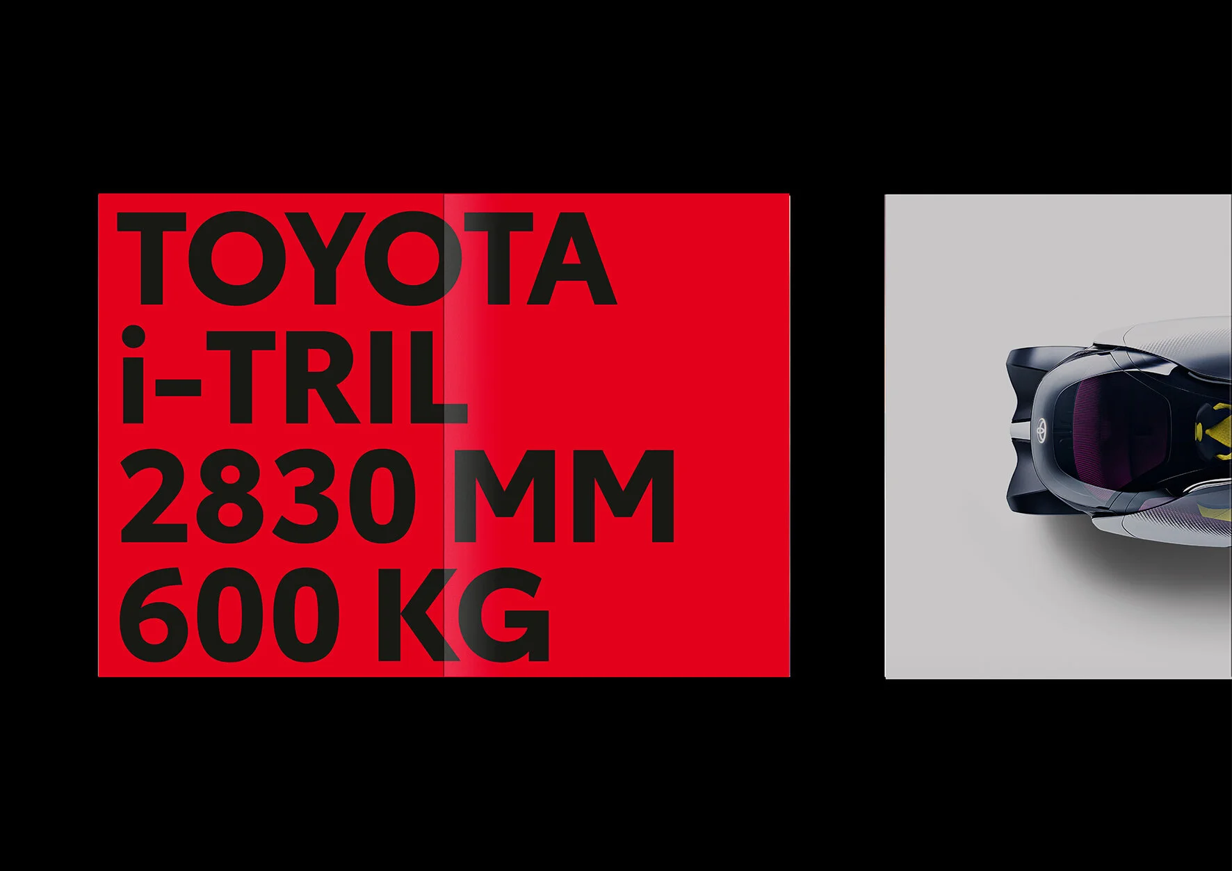
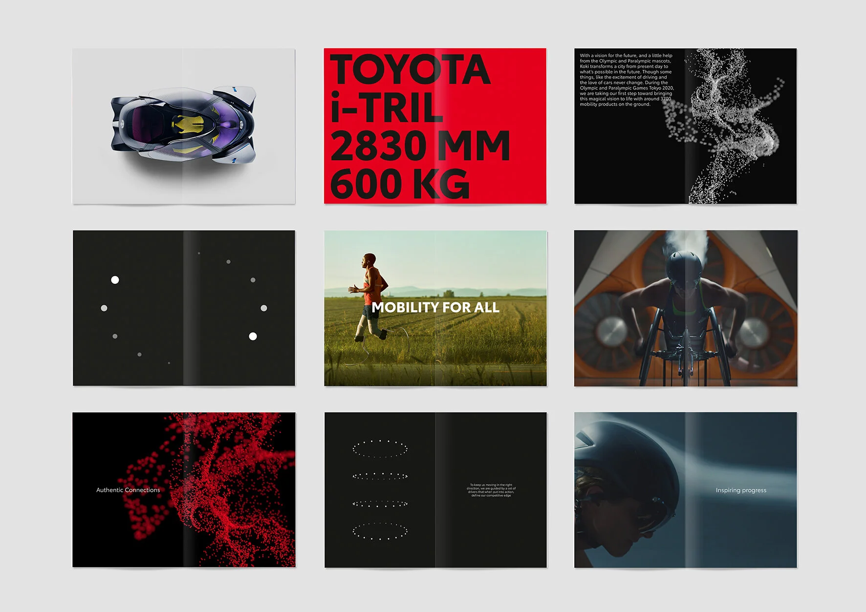
A core part of Toyota’s refresh was evolving an expressive visual identity, inspired by the concept of human mobility in all its forms. The refreshed brand identity and toolbox captures momentum and energy, reflective of Toyota’s vision to provide mobility for all.
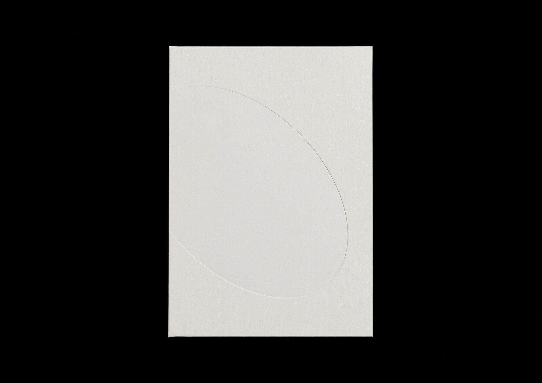
We developed a toolbox for Toyota that would cater for the stretch they need. Two core graphic elements take prominence – the Ellipse representing their history, and the Circle, representing the human atom with its energy and movement. It’s an intelligent design system that highlights Toyota’s technological innovations, reigniting the spirit and feeling of the brand.